Italian Ambassador`s Mansion
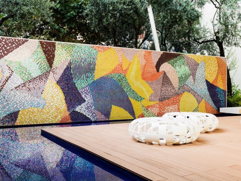
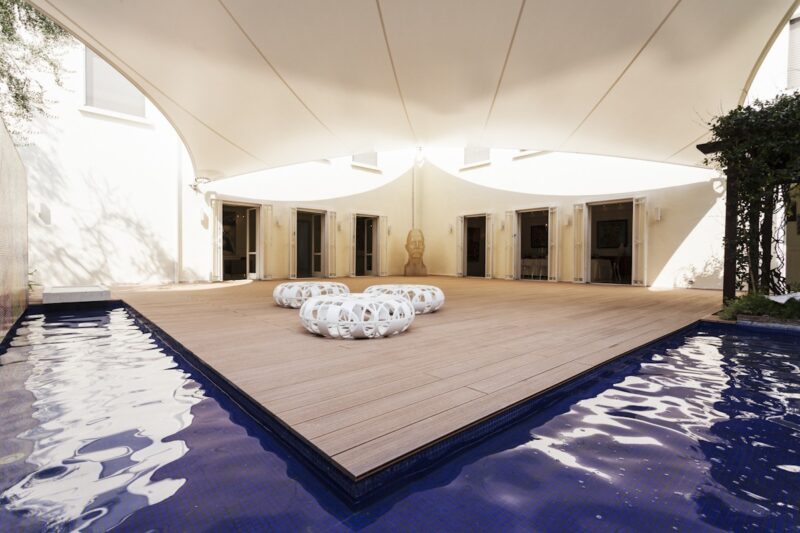
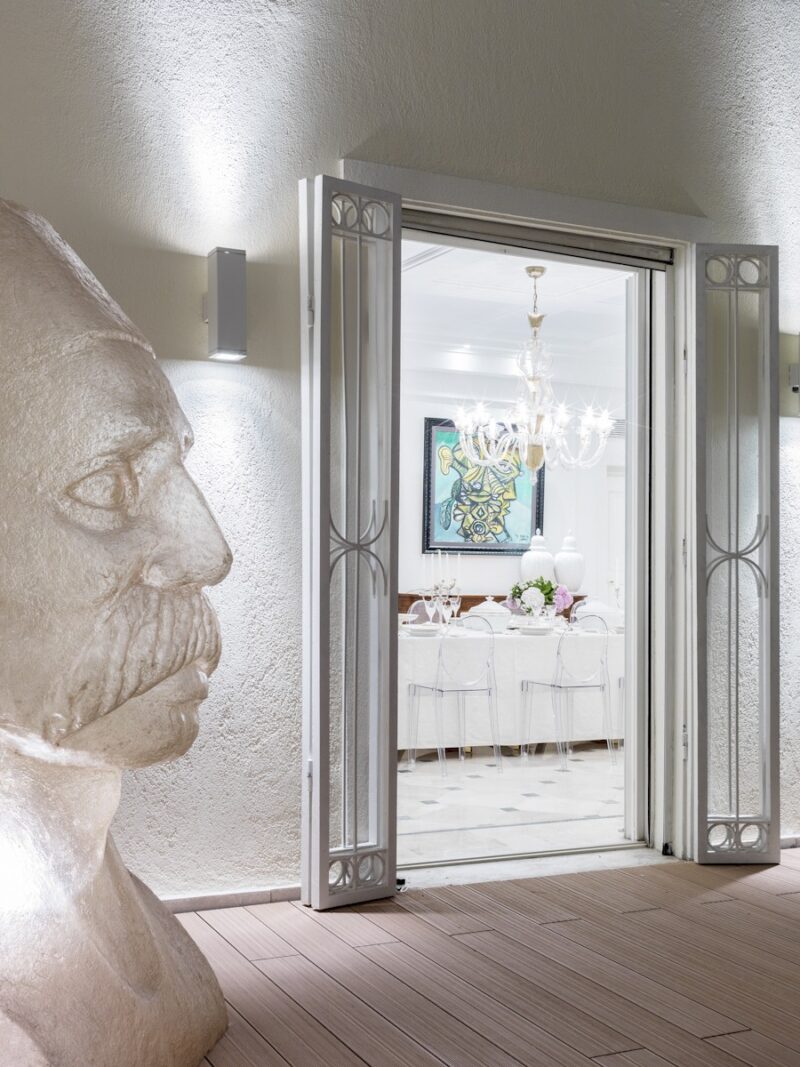
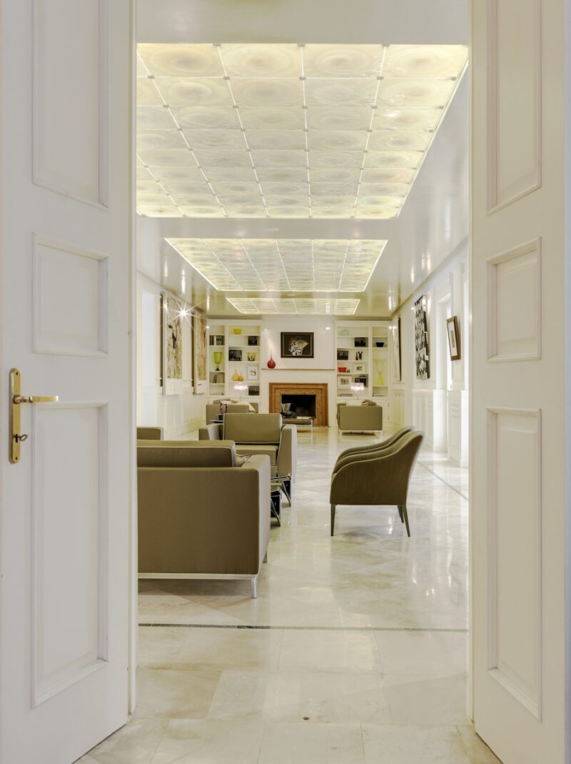
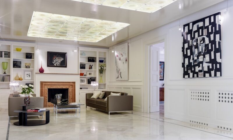
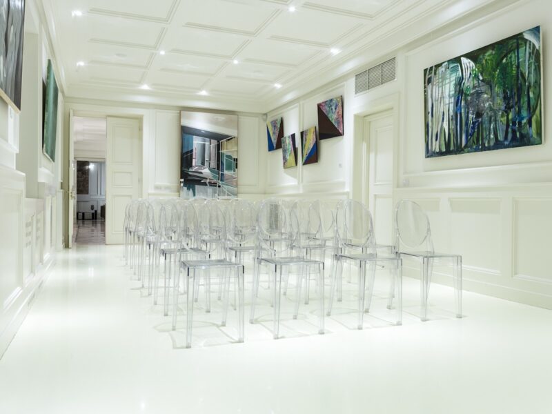
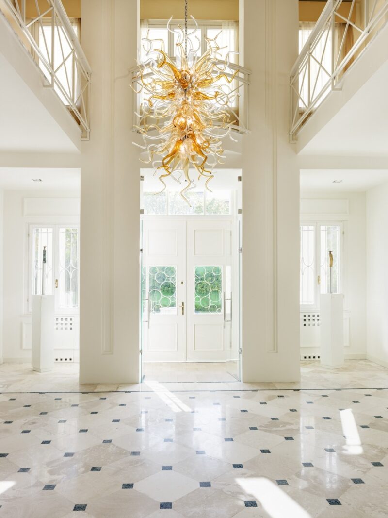
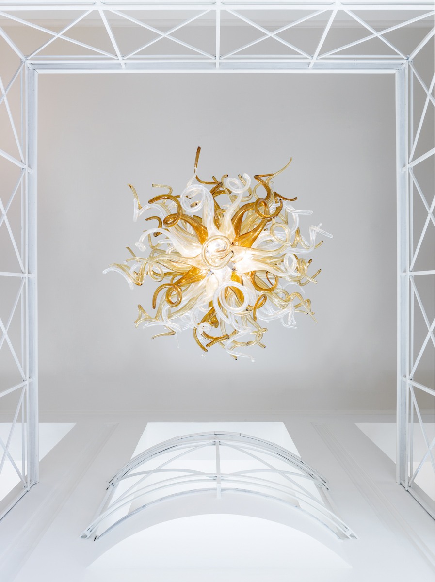
The original building of the Residence dates back to around the 1920s. Between 1946 and 1948 it was used as the Romanian Embassy and later as the headquarters of the United Nations Agency. At that time it consisted of a single central body with respect to the lot with a garden in front of the main front and a very deep garden at the back, thus following the typological scheme of the European neoclassical villa of those years. In 1950 the building was renovated to become the National Museum of Lenin and Stalin. The renovation included the addition of the lateral wing to create new exhibition rooms and an external decorative apparatus including the pediment with the large tympanum supported by four large Corinthian columns. This type of intervention will give the building a strongly neo-Renaissance connotation, recalling the architectural language used for all types of museum buildings in Europe throughout the nineteenth and twentieth centuries. But if the reference to Palladian villas on the facade is so strong, the internal distribution system is not so strong, which instead of developing around a double-height central hall follows a linear L-shaped development with a series of halls that chase each other and that overlook only one side towards the internal courtyard. After becoming the House of Culture and being subsequently abandoned, in 1991 it was purchased by the Italian State to restore it and make it the Residence of the Italian Embassy. The restoration, carried out by the Lattanzi company of Rome, will focus mainly on the architectural renovation of the building (redoing the floors, roof, exteriors and parts of the walls) and will end in 1992. In all the documents found and examined, no mention or trace of particular internal decorative elements was found, except for some elements placed during the 1990 restoration. Thus, the design choice for the internal restyling moved autonomously trying to recreate spaces that recall the classicism of the villas of the early twentieth century with elements and details typical of Italian deco' (backlit glass ceiling, stepped frames and shapes, wooden boiserie, etc.). The project also wanted to include some contemporary elements that in some way expressed the design, craftsmanship and innovation of Made in Italy and that interpreted the design principle of transparency and the ideal and visual connection between the interior and exterior and between the two gardens. The entrance parterre has been redesigned by reinterpreting typical deco designs and reusing the Byzantine-Roman shape of the spiral, creating it with marble mosaic according to the oldest Italian tradition of fine outdoor flooring. The Murano blown glass chandelier at the entrance, with contemporary shapes, brings the center of the visual axis between inside and outside and is reflected in the new transparent crystal entrance compass. The internal courtyard, enhanced by a flooring with a new recomposed wood material with tenacious resistance to the elements, is delimited by a pool of water on which stand two partitions covered in glass mosaic that pay homage to Italian futurism and in particular the art of Gino Severini. This atmosphere that recalls the elements linked to the sea is enhanced by a new tensile structure that stands out with its sails in the wind.
Services:
- Design
- Branding
- Production
